WWDC23 Design for spatial user interfaces
6月16日•16min
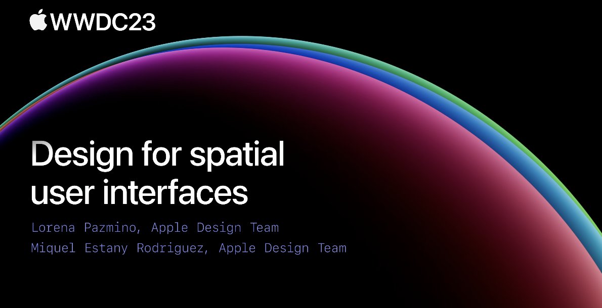
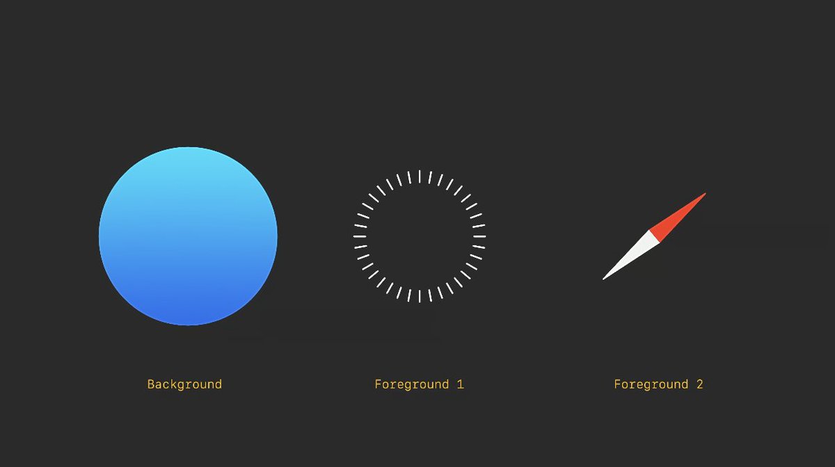
- When designing App icons in visionOS, the icon can be divided into a maximum of three layers (one background layer + two foreground layers), each layer with a size of 1024*1024px. When used, the system will automatically add a glass layer to give the icon depth, highlights and shadow effects, creating subtle depth perception as seen in official videos.
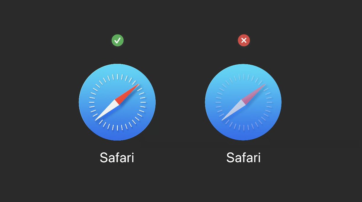
- It should be noted that the foreground layer of the icon should not use transparency, otherwise the automatically added shadow by the system will show through.
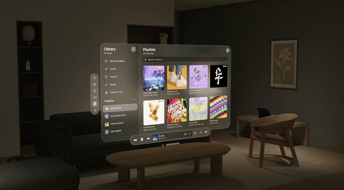
- The window theme in visionOS uses a newly designed glass material, and the system automatically reflects its position in space through highlight shadows (reflection of ambient light) at the edges.
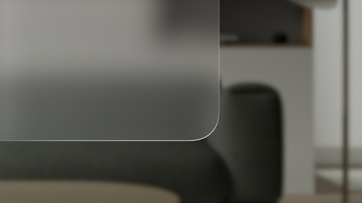
- Avoid using solid colors on windows, too many opaque windows will make the interface feel stuffy.
- There is no explicit light or dark mode in visionOS, but the system will automatically sense the ambient light to adjust the window color contrast and ensure that the content is always visible.
- Use darker overlay layers as the background to increase contrast, and avoid overlapping light-colored materials that may affect readability.
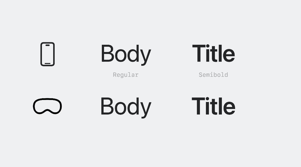
- In order to improve readability and contrast, the font weight in visionOS should be slightly bolder than that of iOS.
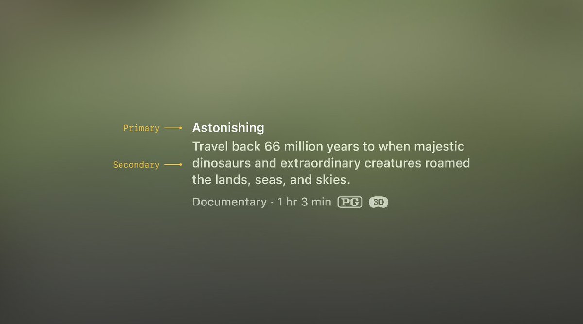
- Apply vibrancy effect to foreground elements instead of simply adjusting transparency. Vibrancy effect can subtly blend the background color into the element, enhancing contrast and readability. For more details, please continue reading here: https://developer.apple.com/design/human-interface-guidelines/materials
- There are three types of vibrancy effects: primary, secondary, and tertiary, which can be used as needed. Here is a related document that can also be referenced: https://developer.apple.com/documentation/uikit/uivibrancyeffectstyle/label
- Emphasize that strong colors should not be directly applied to foreground elements, and try to use system colors as much as possible (because system colors can dynamically adapt and adjust with ambient light).
- Turning your head left or right is easier than up and down, so don't place things too high or low on the screen. The interface should also extend horizontally rather than vertically.
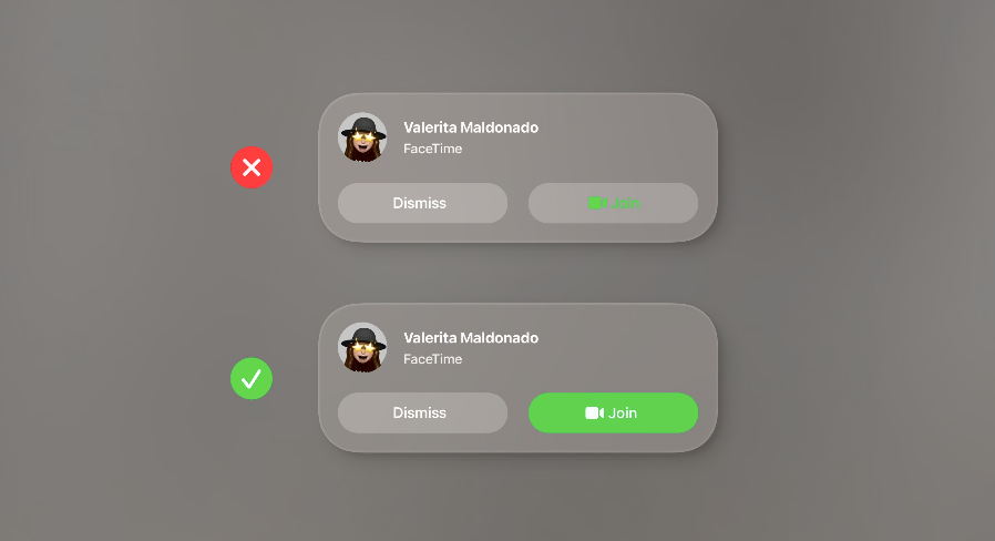
- Interactive elements should have a minimum trigger area of 60pt (the element size can be smaller than the hot zone).
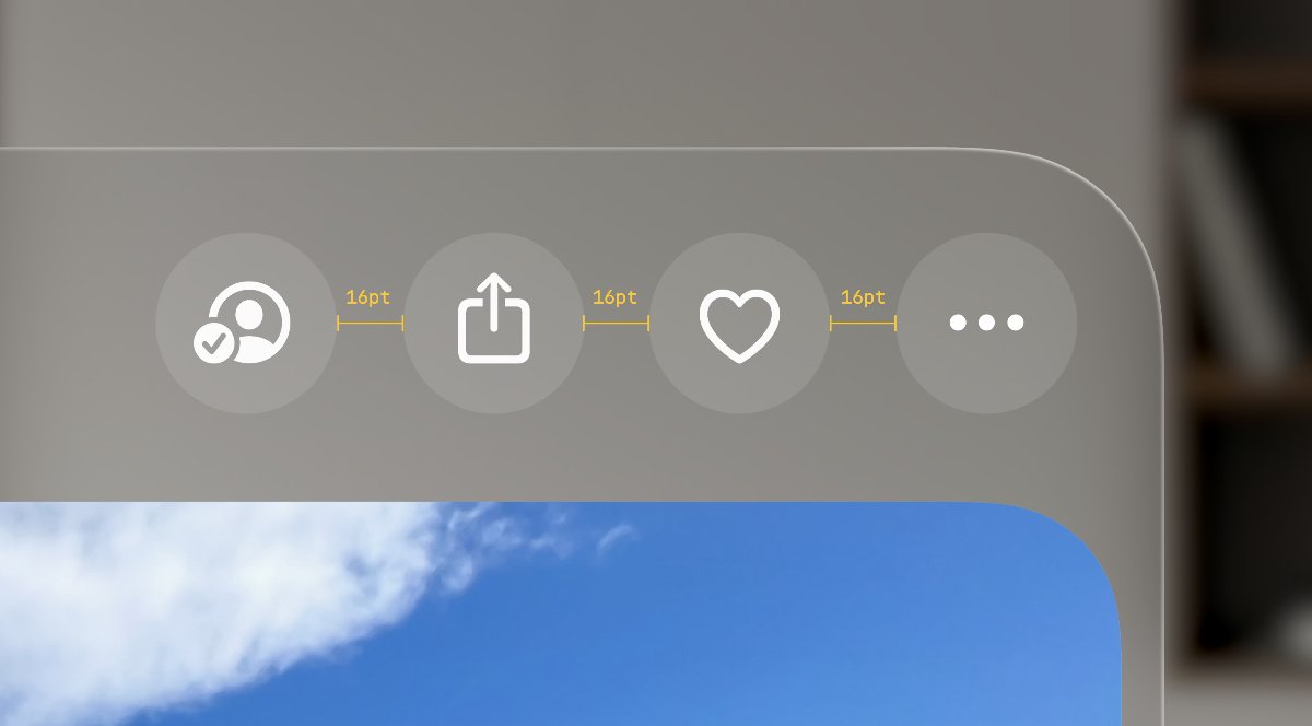
- If multiple buttons are arranged in an area, try to use system standard buttons and leave at least 16pt spacing between the buttons.
- Small interactive buttons can use a size of 28pt (but the hot zone should still be at least 60pt).
- The system controls will come with focus feedback effects (analogous to the hover effect on desktop, in visionOS it is the effect when the eye looks at the control).
- Leave space between the lists, otherwise it will cause overlapping of focus feedback effects. It is recommended to use a 4pt spacing between the lists.
- The rounded corners of nested elements such as cards should be on the same concentric circle, which will look more harmonious and integrated.
Calculation formula: Inner corner radius + padding = Outer corner radius.
- There is a new type of control called "ornaments" in visionOS, which can be used as a floating toolbar for applications.
- The buttons in ornaments should not have a background (because they are already a group of buttons).
- When ornaments are located at the bottom edge, they should overlap with the main interface by 20pt.
- Ornaments can also expand to include richer interactions and content such as
- In visionOS, pop-up menus do not require arrows; system buttons will display white backgrounds when selected, so it is important to avoid designing white-backgrounded buttons that may be confused with system button selection states.
- Close and return functions should always be placed in the upper left corner.
CC BY-NC-SA 4.02022-PRESENT © Elone Hoo